KARYA ANLIAK PLUS PROJECT
My character inspirations from here are the 2 plants
and this character from the left side
First Step: Experimenting and Sketching
Inspired from the eyes of this character sketching:
I sketched with different methods(watercolor, markers, pencils)
I liked the plain one with no eye color I can continue with that
Character No.1
I have experimented with leaves and eyes and created new creatures out of them.
Experimenting with new characters from the things I sketched
I felt a little stuck here so started the new character to get more inspiration
Character No.2
1
2
I liked the eye shape with the red heart. Also the one with yellow shadows is nice. I might use shadows.
Tested eyeball colors here
This character also gives me a lion figure inspiration so I will experiment with that. (volors and the leaf looking shapes)
Also maybe a jellyfish and octopus
Continuing with this part
In the second picture I first started coloring with the pencil marks still not erased. But on the third picture I erased them and then realised that it became more clean and used darker colors to give the shadow
I have found this part the dark green yellow and green part very interesting. The borders and different colors are really cool. I will do experiments with that for the next part.
The flower reminds me of a Lotus flower
The shape of the head also looks like this character from Howl's Moving Castle Movie
Character No.3
Second Step: Sketching New Characters
I will do new sketches based on my sketches adding and mixing things
I tried sketches like this after some point I got stuck because there were too many options. I will get some of the drawings as inspiration and develop that.
These will be my inspirations for the next part
Third Step: Going Digital
keywords:
Drip
Melting
Hot weather
Fantasy(clouds)
triangle
geometry
horns
devilish
creature
damaged
hurt
Eye sketches
I used the alphabet I designed in my elective and made it 3D. I like the effect but it is too empty now
1st one
inspiration
The character gave me a vibe of hiding so I continued with the concept
This inspired me. It looks like a sunset or sunrising and it gave me a story to follow
FINAL POSTER
FINAL POSTER
3rd one
Keywords:
-icecream
-on top of each other
-cold
-ice
-hot weather
-cherry
-vampire
-teeth
-red
-fruit
-cute
-smile
-happy
-cute
-moon
-night
-smiling
-sun
-vampire
-teeth
-hot
-summer
-day
-morning
FINAL POSTER
I choose some from them:
HOW DID I CAME UP WITH THIS CHARACTER:
-dripping
-stems
-eyes
HOW DID I CAME UP WITH THIS CHARACTER:
-dripping
-eyes
-head shape below
-the stain looking drawing rounded shapes I drew on the leaves
HOW DID I CAME UP WITH THIS CHARACTER:
-I had already drew this jellyfish looking creature.
-I added more eyes to it
HOW DID I CAME UP WITH THIS CHARACTER:
-horns
-devilish
-dripping
HOW DID I CAME UP WITH THIS CHARACTER:
-the character below
LAST PHYSICAL SKETCHES:
inspiration
PLUS PROJECT PLAN
The alphabet I designed for my elective:
I didn't like the rainbow looking drawing so I deleted that
Also the sun. It was too much
2nd one
I added eyes but didn't like it so I continued developing
Turned the shape backwards
I finished the concept but didn't like the end result so I continued returning back to the main character sketch
insipiration for cloud
I didn't like the clouds so I continued
Dripping
inspirations
I wasn't satisfied with the results so I started to think of a concept to create:
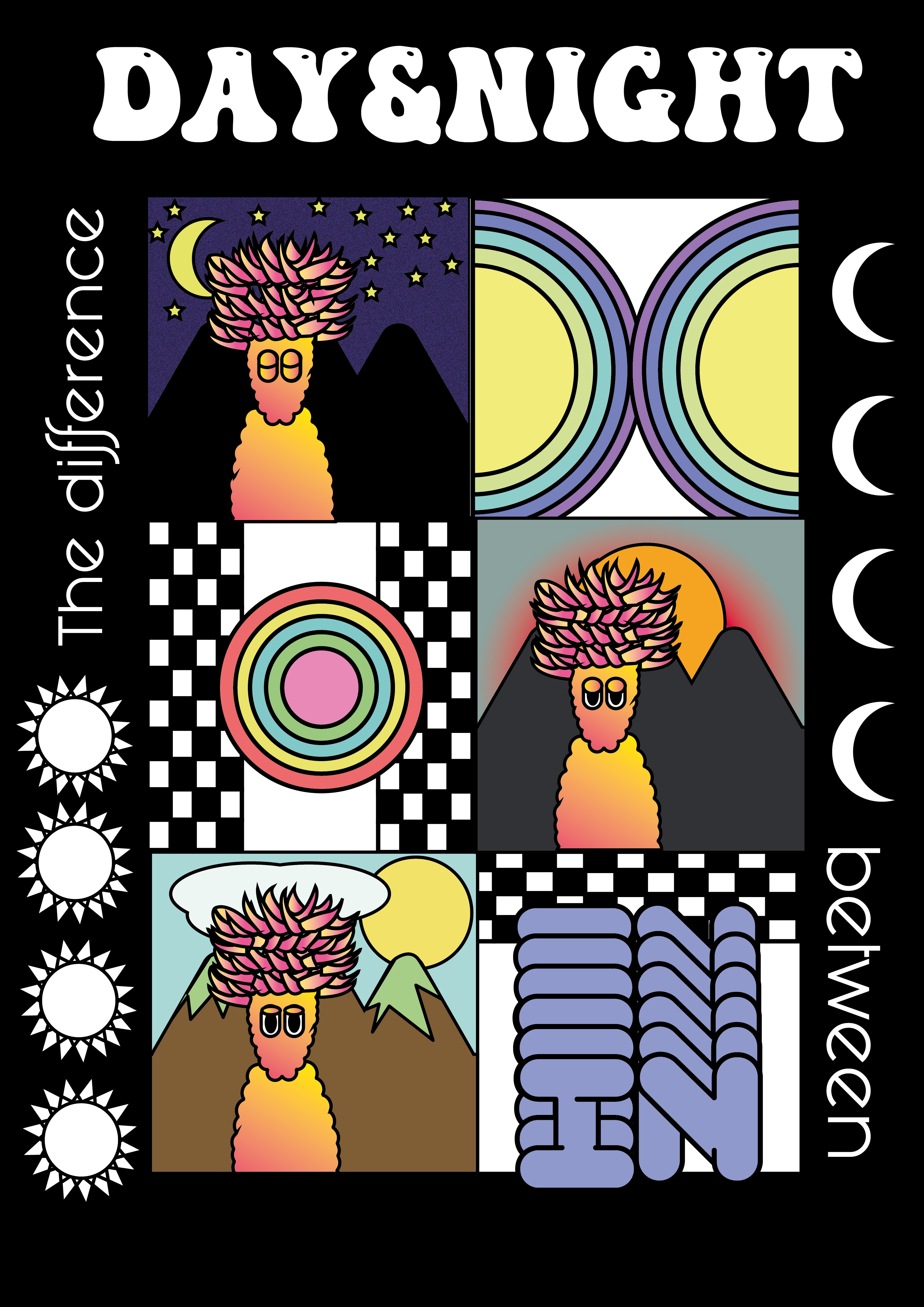
I made 3 frames:
-night
-sunrise
-day time
One of the things that was changing in the frames was the background and they were different from each other so I was inspired from getting to the quote
Added and deleted some things and went to the final and the last version of the poster
Started off with IPAD
inspirations
Starting experimenting:
Decided to choose one and go with that
Didn't like making the 'TEETH' with my letters so I decided to use it in the background
I also wasn't satisfied with this poster so I continued experimenting:
I learned about this tool in Adobe Illustrator and used it.
I also used my letters but it didn't fit so I deleted that part
I added new things and this was the final result:
IMPORTANT:
The order and the process goes like this:
Then to the works under
FINAL POSTERS
I came up with the quotes based on what the character looks like and has and it rhymed in the end there was a short story line which I liked


My self defined goal was to create new posters from the characters I was inspired from. I created more than one characters. Some have similarities with the characters I got inspired from. There were many things I sketched and came out with a final result. I was really excited to make the posters and I actually had no idea of how would they become. It was unknown for me.
I always enjoyed looking at other artists characters and always wanted to try some and plus plan was an oppurtunity for me to do it. I wanted to make a poster in the end for the character/characters I did but now I have three of them so I reached my goal. I liked the design of them and want to hang them in my wall quickly as possible.
My goals were to improve my digital skills on Adobe Illustrator and I reached my goal. The first digital sketches weren't so good but after experimenting and trying to improve it got better and has a good result in the end.
I had mentined that designing posters are important for graphic designers and one of my goals was to be better at that. At first I had a hard time putting the character on the poster in a good design. I felt a little stuck but after I experimented it got better and I had improved. I did do posters in my past but this plus plan was different from them. I had time and focus to be better at it and I am better and more comfortable with designing posters now.
MOTIVATION FOR YOUR SELF DEFINED GOAL AND HOW IT CONNECTS TO YOUR VISUAL OUTCOME:
OVERVIEW AND CONCLUSIONS:
I started of with sketching and experimenting the characters in different ways. I analysed the parts of the characters and sketched individually for many different parts. Such as I got inspired from the eyes from some of them and created sometimes similiar and sometimes not similiar sketches. There were mainly three characters I could get inspired from so I sketched about each character individually in the first step physically. In the next part I mixed the things I sketched and added a few things to them and came out with new characters. I chose from some of them because there was too many. I started to sketch digitially for the chosen characters and improved those sketches.
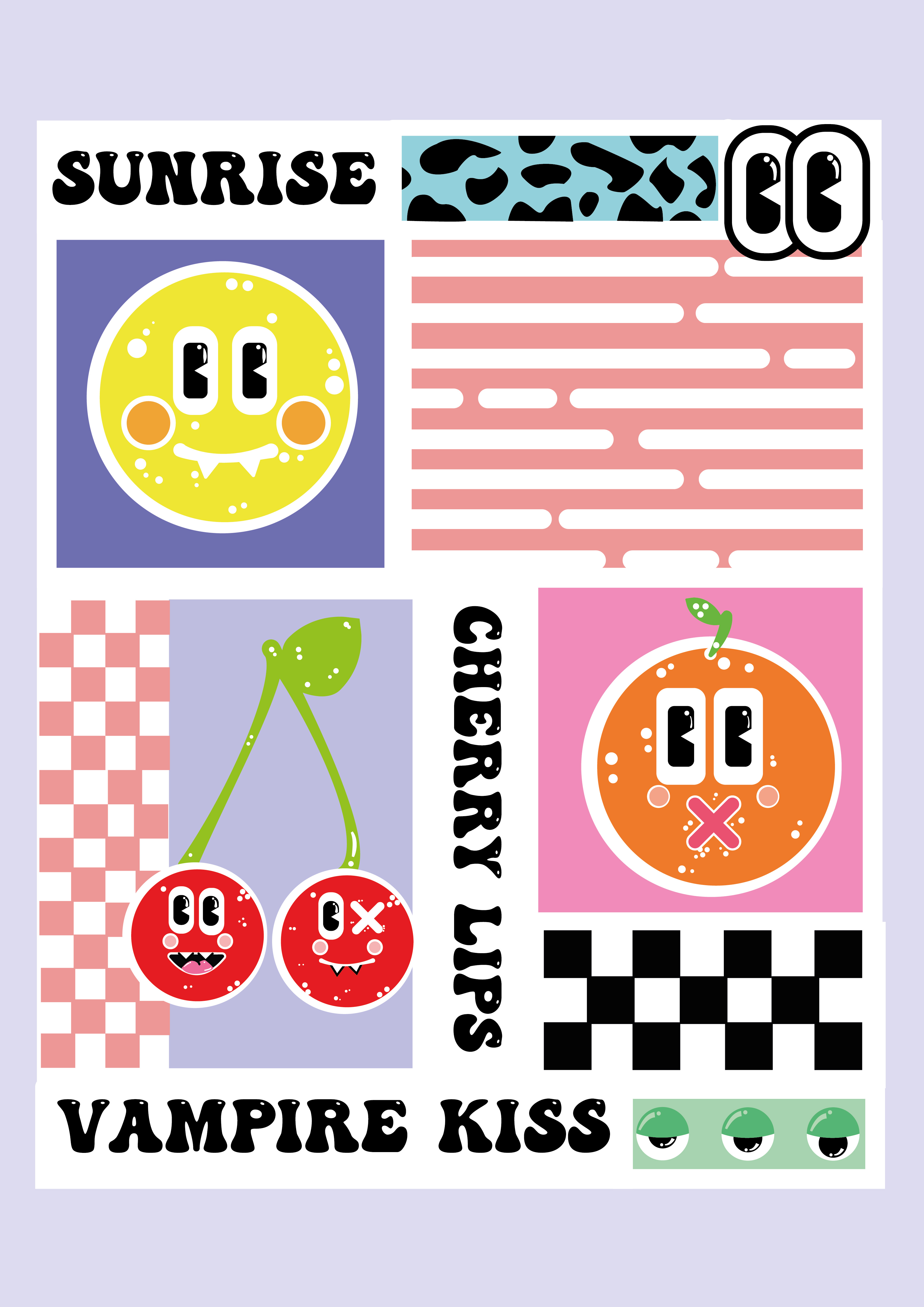
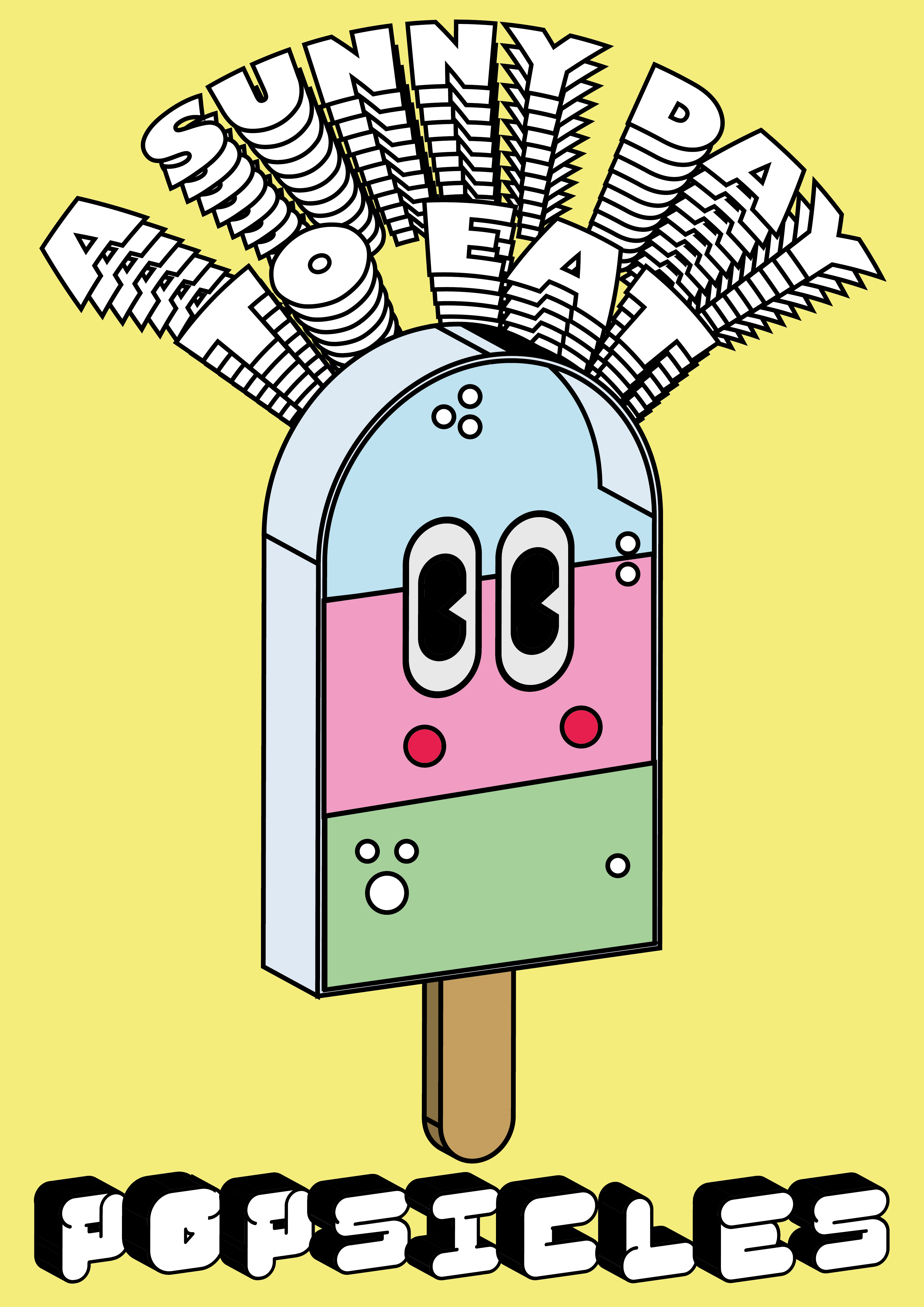
For making the posters I experimented with many things such as the colors, the organisation on the paper, shapes and so on. I created 3 posters in total. 2 of the posters have only one character but the third poster has 3 characters.
I has started off with what might the poster announce and thought of that but after sketching the characters got different so I continued improving the characters. Near the end I was inspired what the characters have and what they are connected to and came with quotes like that. Such as the cherry has vampire teeth so I used that in the writings on the poster. The sun rises and goes down so I used that to connect to a little story. It came a lot different with the first ideas I had about what the posters may say about. The characters came out very different than the first sketches so it was surprising for me aswell.
Overall, the experience was sometimes difficult but it was different from what I do everyday and I really enjoyed it.
I had extra time so I also made stickers and put them around the city and continuing to do that.
2 LEARNING OUTCOMES:
1) I learned about and experimented with this tool( Width Tool) in Adobe Illustrator
2) Adding details and different colors to the characters make the characters more appealing. Such as the white dots. Especially the ones under the X shape gave the mouth a graffiti look which I liked in the end.
3) I learned to print posters in the Print Studio matte printer.
4) I learned to print stickers at the Print Studio.
Final Conclusion of the poster:
-The character was inspired from the head shape of the character I got inspired from. As I mentioned the rainbow looking sun shape inspired me creating the concept. Also the character I was sketched looked a bit tired. That was also something that helped me create the concept. I used the alphabet I designed in my elective on the word 'IN'.
Final Conclusion of the poster:
-The circle shapes, X shape and the mouth comes from the first character. I created the concept of looking at what the characters have. In the end there was kind of a little story and it rhymed with each other. I used the typeface I used in the poster before this (DAY AND NIGHT TEXT) because I felt like it was a fun typeface that would suit my characters.
Final Conclusion of the poster:
-In this poster I wasn't inspired from the characters a lot like the other 2 ones. It started off with an idea and I developed that into a character on it's own. I chose this sentence for it to fit with summer vibes. Hot weather, cold drinks and icecream, sun... I used my alphabet I designed in this poster also.
I FINISHED EARLY SO I DEIGNED PAGES LIKE THIS:
Printing Out
Also Did a Mock Up
After my feedback with Mark I decided to make little stickers out of them and put them around the city
LAST PHYSICAL SKETCHES:
LAST PHYSICAL SKETCHES:
LAST PHYSICAL SKETCHES:
LAST PHYSICAL SKETCHES: